
みなさんこんにちは、ZeroTerasu(@ZeroTerasu)です。
今回は、html要素を横並びに配置する方法について解説します。
主に下記の2種類の手法が用いられます。
- flexbox
- grid layout
flexbox と grid layoutの違い
flexboxは要素を一方向に横並びにする手法です。そのため、対象の要素がはみ出す場合は、折り返されて配置されます。
flexboxは横並び配置する、メニューやヘッダー等に使用されることが多いです。
grid layoutは、各要素毎にサイズを個別設定できるためflexboxと比較して自由度が高いです。但し、コード量が増加してしまうため、特定の要素で個別設定が必要な場合を除いてflexboxを使用する方が楽な場合が多いです。
flexbox
対象要素が格納されている親要素に対して、”display: flex;” を設定することで一方向に要素を並べることができます。
更に、”justify-content: space-between;”を設定することで水平方向に均等配置することができます。
<!DOCTYPE html>
<head>
    <link rel="stylesheet" href="css/style.css">
    <title>Document</title>
</head>
<body>
    <div class="parent">
        <div class="child">子要素1</div>
        <div class="child">子要素2</div>
        <div class="child">子要素3</div>
        <div class="child">子要素4</div>
    </div>
</body>
</html>
.parent{
display: flex;
justify-content: space-between;
}
.child:nth-child(1){
background-color: aqua;
}
.child:nth-child(2){
background-color: burlywood;
}
.child:nth-child(3){
background-color: violet;
}
.child:nth-child(4){
background-color: darkseagreen;
}
grid layout
grid layoutを用いると、行数・列数を自由に変更することが可能です。
“display: grid;”と指定することで、各要素を一方向に配置することができます。
“grid-template-rows”で行の指定(縦方向の ” 1. 要素数 “・” 2. 要素の大きさ” )を指定することができます。)
“grid-template-columns”で列の指定(横方向の ” 1. 要素数 “・” 2. 要素の大きさ” )を指定することができます。)
行・列それぞれのgrid-templateに”auto”を指定することで、均等サイズになります。
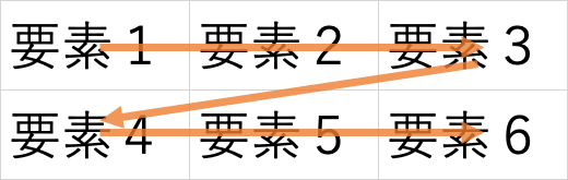
2行・3列のgrid layout
<!DOCTYPE html>
<head>
    <link rel="stylesheet" href="css/style.css">
    <title>Document</title>
</head>
<body>
    <div class="parent">
        <div class="child">子要素1</div>
        <div class="child">子要素2</div>
        <div class="child">子要素3</div>
        <div class="child">子要素4</div>
        <div class="child">子要素5</div>
        <div class="child">子要素6</div>
    </div>
</body>
</html>
.parent{
display: grid;
grid-template-rows: auto;
grid-template-columns: auto auto auto;
}
.child:nth-child(1){
background-color: aqua;
}
.child:nth-child(2){
background-color: burlywood;
}
.child:nth-child(3){
background-color: violet;
}
.child:nth-child(4){
background-color: darkseagreen;
}
.child:nth-child(5){
background-color: darkkhaki;
}
.child:nth-child(6){
background-color: yellow;
}
1行・6列のgrid layout
index.htmlは共通のため省略します。
列数分grid-template-columnsにautoを指定します。
.parent{
    display: grid;
    grid-template-rows: auto;
    grid-template-columns: auto auto auto auto auto auto;
}
.child:nth-child(1){
    background-color: aqua;
}
.child:nth-child(2){
    background-color: burlywood;
}
.child:nth-child(3){
    background-color: violet;
}
.child:nth-child(4){
    background-color: darkseagreen;
}
.child:nth-child(5){
    background-color: darkkhaki;
}
.child:nth-child(6){
    background-color: yellow;
}

コメント